

The plan
To explore different design systems, design patterns, what other companies were doing and redesign the adviser portal accordingly. To make it more modern, on brand and easier for advisers to use while also creating a new design system to give the designers and engineers a set of cohesive tools and simplify the design and development process.
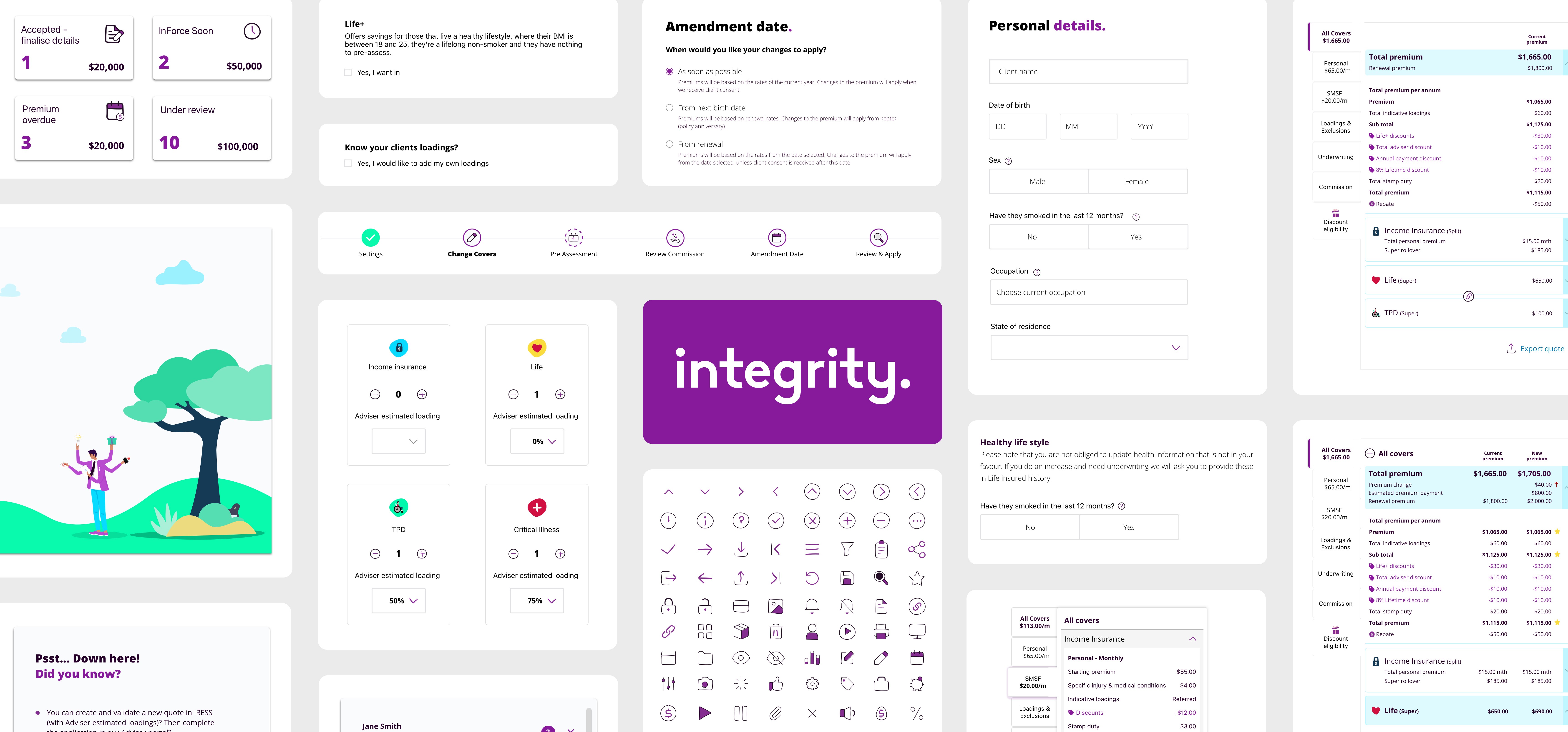
The objective
To redesign the adviser portal to make it easier to use
To update the design in line with how our brand had evolved
Simplify the adding cover processes
Create a new cohesive, simple design system
The rules
Being a highly regulated industry, everything needed multiple levels of sign off. None of the existing information currently in the portal could change. Only the design and the interactions.
Research
I researched a wide range of companies from insurers to fintechs and telcos, focusing on how they handled forms and information collection. I also interviewed advisers to understand what they liked and didn’t like about our portal, and how easy it was for them to use. Based on those insights, I explored design systems like Google’s Material Design and Apple’s guidelines, narrowing down what best suited our brand. I then built simple prototypes and tested them with advisers and the Customer Experience team.

Testing
Extensive testing was carried out both internally and externally. The feedback received was that it felt like it was more fun (which was a brand requirement), it was so much easier to digest all the information, what they needed to do and the adding and changing covers was now so much easier to figure understand and a much smoother process.
I heard from both designers and engineers that our old design system was “over complicated" and "hard to use”. Our old design system was confusing, bloated, and inconsistent. Components didn’t behave predictably, engineers weren’t always sure which to use, and somehow we’d ended up with 16 variations of an accordion.
I led a major overhaul to simplify and streamline the system. We ran a full audit, rebuilt key components for flexibility and consistency, and rewrote the documentation to make everything clearer. I also developed a new library of web modules to support our updated brand and product direction.
Due to business requirements and timeframes, we were required to implement an incremental rollout to specific sections and components. Implementing the changes as we worked on other projects and parts of the portal to visually uplift the product without compromising usability or the delivery timeframe of other projects.
The launch
- Redoing our entire design system of over 80 Components, as well as developing a new Adviser dashboard and email components.
- Redesigning over 200 screens across all platforms
Redesigning client forms such as quote and application reports, renewals and other external documents and communications.


Currently looking for work. Say Hi
James Gardner © 2025