
The aim of the adviser dashboard was to create a landing page where advisers could find out information about their quotes and applications but where we could still communicate business updates and changes happening. This project was already in progress when the portal redesign started being rolled out across the portal and was one of the first projects to incorporate the new designs and go live.

The plan
To create an adviser dashboard in line with the new portal designs, that would make life easier for the advisers so they could easily find information about their quotes and applications.
The objective
Research what advises wanted and needed
Make the dashboard more appealing
Create an adviser dashboard in line with the new portal design
Create a space where we could communicate business updates and changes happening
Create and update components for our new design system
UX challenges
I was working with another UX designer on this project, who had already conducted the initial research and provided the below solution to the business. Plus this project needed to be completed whilst the portal redesign was still being worked on.
I had to get onboard and quickly understand the business and adviser needs.

But wait…
We can do more!
Immediately it was clear to me if we were going to make a dashboard it could do so much more for the advisers.
Having looked through the research which had already been carried out, I widened the scope of what we could include and after listening to all the interviews and through affinity mapping I was able to determine that:
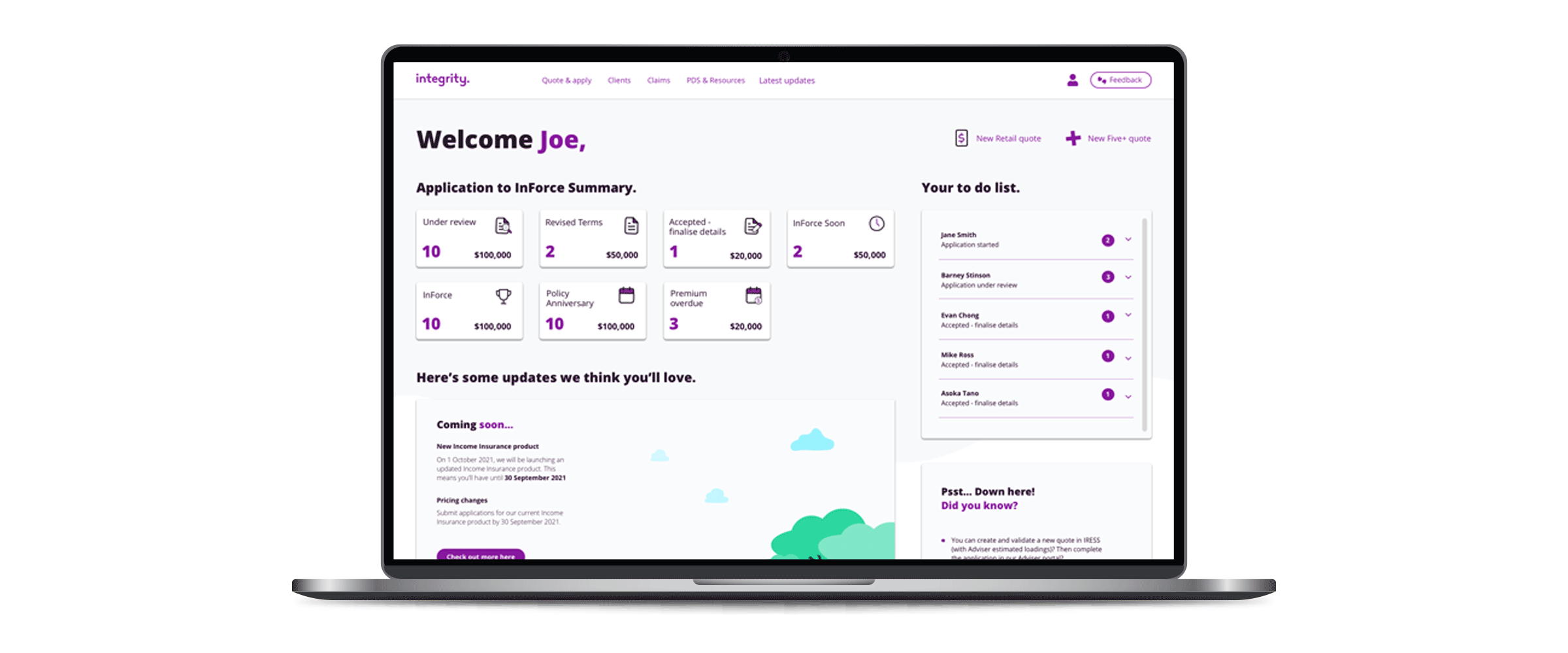
Advisers wanted a clear indication of where their applications were at
They wanted to be able to clearly see:
– What stage their applications were in
– How many applications were in each stage
– Easily see if there were tasks they needed to perform to further their application
– How many applications they had in forceStill want us to communicate with them about whats happening
Part of the business wanted to sacrifice how we communicate to allow the new dashboard and the other part still wanted keep the existing design.
Now I had my research, I began work on new designs, keeping in mind the work that was also being done on the portal redesign at the same time. It was important to ensure the new dashboard designs were inline with the portal redesign.

- Advisers wanted to include more information to give them a more visual representation of inforce policies the 2 additional key inclusions were:– Policy Anniversary - they wanted to know which policies were going to be renewing soon
– Premium Overdue - they wanted a clearer idea of how many clients premiums were overdue - They missed all the panels we used to communicate with them
- The business was thinking of including more information for advisers in the future
- The business needed clearer communication with advisers
Design round 2
With that feedback in mind I needed to tweak the designs to provide more information to advisers, but also future proof the designs for future advancements.
I also created a latest updates page which advisers could click through to. It would contain all the updates and communications from us and also give them the ability to not only let us know if they liked the update but also give us feedback either on the updates we had made or other things they might like to see.
Each of the panels would click through to existing pages in the portal allowing Advisers to easily navigate to the exact applications or clients they needed to view.

Advisers also loved how easy it was for them to navigate and find the information they were looking for as well as how it all linked to the existing portal and how easy it now was to get to the exact application or client they needed to view in just a couple of clicks.


Currently looking for work. Say Hi
James Gardner © 2025